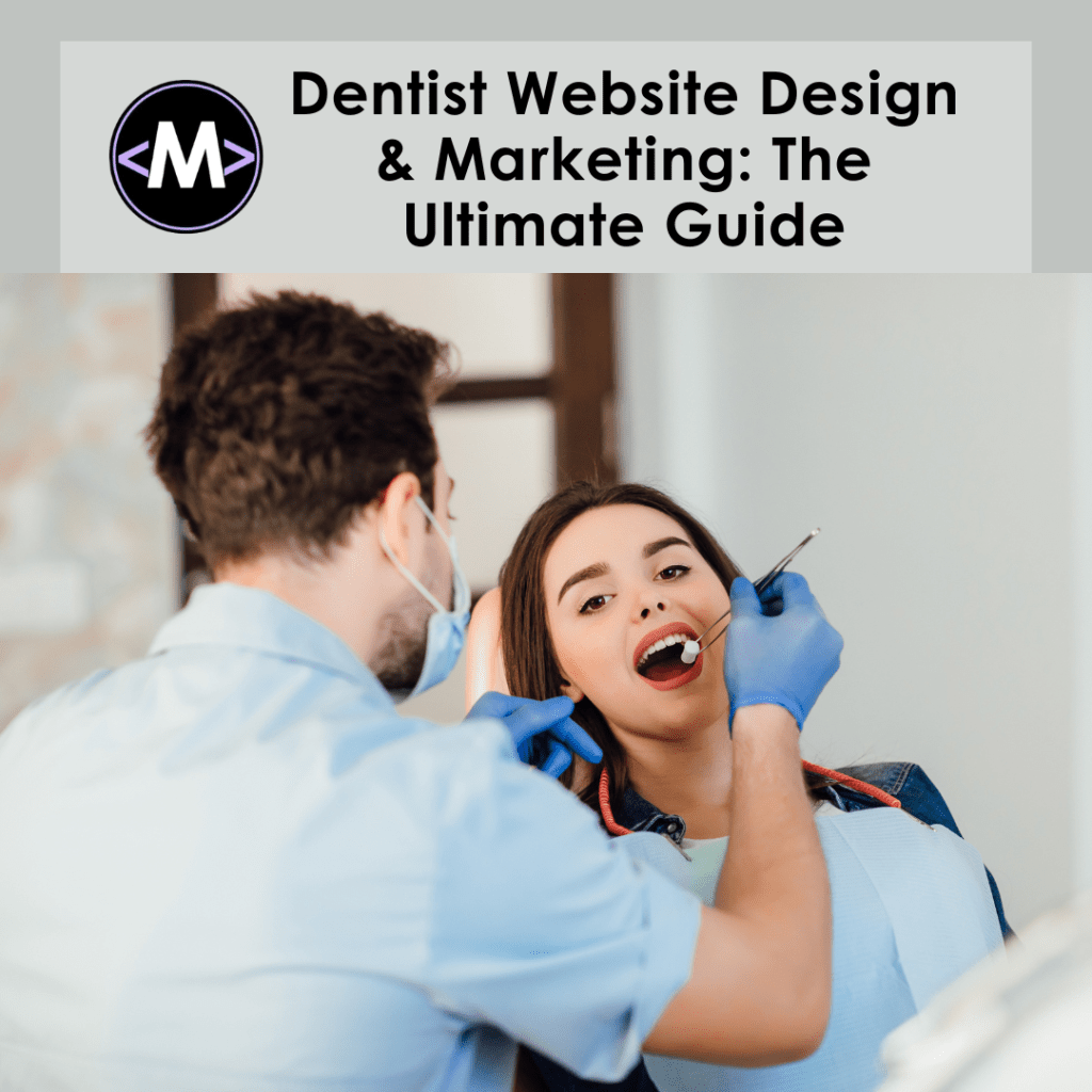
Let’s face it, folks. The world of dentistry isn’t exactly known for its laugh riots. Sure, there might be a giggle or two during nitrous oxide adventures, but generally speaking, dental visits aren’t high on the “comedy club” list. But that doesn’t mean your dentist website has to be as dull as a lecture on flossing (although, flossing is super important, by the way!).
Here’s the truth: in today’s digital age, a website is your online smile. It’s the first impression you make on potential patients, and let’s be honest, if your website looks like it belongs in the dial-up era, you’re more likely to get a “yikes” than a “wow.”
So, how do you craft a dentist website that’s both informative and, dare we say, delightful? Buckle up, because we’re about to embark on a journey through the wild world of dentist website design and marketing, complete with a few laughs (and maybe even a sprinkle of dental puns – you’ve been warned!).
Why Does Your Dentist Website Matter So Much Anyway?
Imagine this: you have a throbbing toothache that’s making you want to headbang against the wall (metaphorically, of course). Your first instinct? Grab your phone and unleash the power of Google! If your dentist website doesn’t show up, or worse, looks like it was cobbled together with dental floss and toothpicks, those potential patients are bolting faster than a kid who sees a dentist’s drill.
A Winning Dentist Website: It’s All About Making a Great First Impression
Think of your website as your online dental chair. It should be:
- Inviting and Comfortable: High-quality photos of your practice (think calming colors, not scary x-rays!), a friendly team introduction, and easy navigation are key. No one wants to get lost in a website maze!
- Informative and Clear: Explain your services in clear, concise language. Bonus points for using layman’s terms – nobody wants to decipher dental jargon after a bowl of sugary cereal.
- Action-Oriented: Make it easy for patients to book appointments, contact your office, or learn more about your services. Big, clear buttons and a user-friendly contact form are your friends.
Don’t Let Your Website Be a Relic From the Stone Age
Remember those clunky flip phones with the antennas that doubled as torture devices? Yeah, your website shouldn’t resemble one. Here are some website design trends that will keep your online smile looking fresh:
- Mobile-Friendly is a Must: Everyone uses their phones these days, so make sure your website looks fantastic on all devices. Think responsive design, people!
- Embrace the Power of Visuals: High-quality photos of your smiling staff, happy patients, and maybe even some adorable teeth models (we can’t all be stock photo models, right?) will go a long way.
- Let Your Personality Shine Through!: Don’t be afraid to add a touch of humor (as long as it’s not about root canals!). Show your patients you’re a real person with a sense of humor (and a passion for healthy smiles!).
Marketing Your Dentist Website: Spreading the Word About Your Awesome Choppers
Building a stellar website is only half the battle. Now you need to get people to see it! Here are a few marketing tricks to make your online smile contagious:
- SEO Savvy: Search Engine Optimization is like dental floss – it gets to the hard-to-reach places. Research relevant keywords (think “dentist near me”) and sprinkle them throughout your website content.
- Embrace the Power of Social Media: Show off your fun office culture, share dental hygiene tips, and even run contests on platforms like Facebook and Instagram.
- Online Reviews Are Your Best Friend: Encourage happy patients to leave glowing reviews on Google, Yelp, and other platforms. Positive reviews build trust and show everyone you’re not just another dentist, you’re a dental rockstar!
Feeling Overwhelmed by the Digital Dentistry Maze?
(No worries, it’s not all about drilling and fillings!)
Look, let’s face it, building a great website and crafting a killer marketing strategy can feel as daunting as explaining the importance of flossing to a teenager. That’s where Max Advanced Solutions comes in! We’re a team of dental marketing wizards and website wranglers who are passionate about helping dentists like you shine online.
Here’s why Max Advanced Solutions is the ultimate dental marketing sidekick!
- We Speak Dentist: We understand the unique challenges dentists face in the digital world. We’ll work with you to create a website and marketing strategy tailored to your specific practice, whether you’re a seasoned dental veteran or just starting out.
- Data Doesn’t Scare Us: We’re obsessed with data and analytics (almost as much as we are with healthy smiles!). We’ll track your website’s performance and make data-driven decisions to ensure your online presence is pulling in new patients like a magnet with a sweet tooth.
- Results You Can Brag About: We don’t just build pretty websites. We build websites that get results. We’ll help you attract more patients, increase bookings, and ultimately grow your practice so you can focus on what you do best – creating dazzling smiles!
Ready to Ditch the Digital Dentistry Stone Age and Show Off Your Sparkling Website?
Head over to maxadvancedsolutions.com/project-inquiry-form, fill out the form, and get a FREE consultation today! We’ll talk about your dental practice goals, answer any questions you have, and show you how we can create a website that’s as informative as it is delightful.

Remember, in the digital age, having a great smile isn’t enough. You need a website that smiles just as bright! Let Max Advanced Solutions help you craft an online presence that’s the envy of every dentist in town, and watch your patient base grow faster than a wisdom tooth overnight (hopefully in a less painful way!).
You can also check our other interesting blog posts here: maxadvancedsolutions.com/blog
Make sure to follow us on Instagram for all the exciting updates!

